How To Get The Most Out Of The Good Sign Grid
About Grids
In Good Sign, grids can be managed with multiple functionalities: Refresh, Select a Template, Save a Template, Delete Template, Collapse All, Expand All, Clear Custom Settings, Clear Filters and Export. These functionalities can be very useful when searching for a certain item/data or data set. Regardless of the dashboard used, the functionalities available to manage and use with the grid are the same. This user guide focuses on the grid elements functionalities from a general perspective.

Refresh
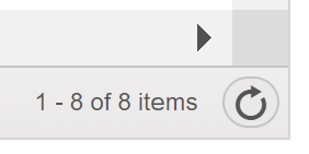
In the bottom right corner of each grid, there is a refresh button that refreshes the changes made in the grid, but also the data in the background. After adding, editing or deleting something, you may have to press the refresh button to see the changes.
Save Template
If you have recurring personal preference about settings in your grid, you can save them as a template. For example, in invoice preparation window, templates can be used to show only invoices that have status as “new”. Also, there could be another template that illustrates the number of invoices sent to certain organizations.
Templates can also be used in sorting matters. You can arrange the grid to your liking and save it as template for further use. Your saved templates are only visible to you.
To create a new template, set your desired settings, groupings and filters and then press Save Template. After that a pop-up window appears:
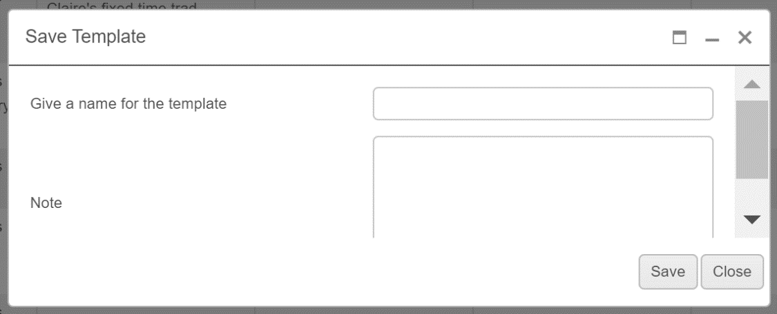
In the Save Template window you can add a name for the template and additional notes. When the needed information has been added, press Save.
The saved templates will automatically appear in the grid when entering but can be easily changed by following the Select a Template guide below or selecting Clear Custom Settings.
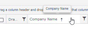
Tip! Columns can be reorganized by using the drag-and-drop mechanism
Select a Template
After Templates have been created, they can be selected in the Select Template menu:
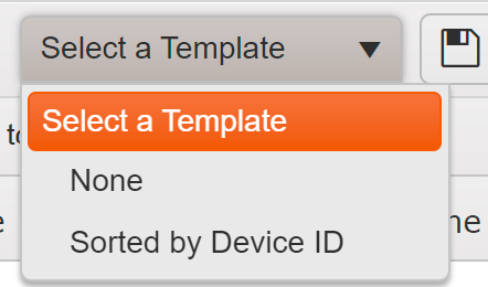
The alternative templates will be shown as a list and can be added to the grid they were made for.
Delete Template
Saved Templates can easily be deleted by first selecting the template in Select Template and then pressing Delete Template. After that press OK to verify the action.
Sorting
The columns can be sorted in the grid to ascending and descending by clicking on the column headers.
Grouping
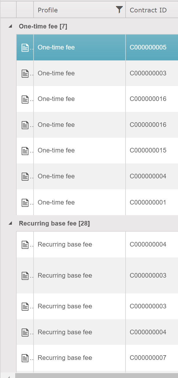
Grid grouping is extremely handy if you i.e., want to see what prices are ending in the future months. Simply group by Valid to and sort the grouped value and you can see pricing lines that need action in the future months. The grid data can be grouped by dragging the column headers to the field Drag a column header and drop it here to group by that column. It depends on the dashboard, whether or not sorting, grouping and filtering are available.

The groupings can be easily withdrawn by pressing X next to the column header in the grouping field. You can also choose the amount of rows shown from the bottom of the grid.
Caution! When using grouping function, the grid illustrates the groups correctly only when all the rows are visible at the beginning. This can be very slow when it is utilized with a large number of rows. This is why it is not recommended that the grouping be done with multiple column headers.
Filters
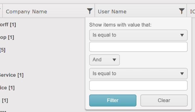
The grid data can be filtered by pressing the funnel sign next to a column header. It depends on the dashboard, whether or not sorting, grouping and filtering are available.
In the filter pop-up window, there are many possible alternatives for showing the values. The field under “show items with value that” has the following options: is equal to, is not equal to, starts with, contains (does not need any wildcard sign), does not contain, ends with, is null, is not null, is empty, is not empty, has no value, has value. Also, there is an option to choose more filters by first selecting a logical operator (and/or).
Lock Columns
Lock Columns is a feature in Good Sign that allows chosen columns to remain visible on the screen, while scrolling through the remaining columns. This is particularly useful when you want to keep certain information visible, such as labels or other important data, even when the user is scrolling through a large dataset that extends beyond the visible screen. By freezing columns, you can easily access important information without having to constantly scroll back and forth horizontally. The feature is available in most
grids within the GS software. Figure 8 How to navigate to the Lock Column functionality The Lock Columns functionality can be easily accessed by clicking on the three dots next to the column that you want to freeze. From there, you can select the Set Column Position option, and then choose Lock Column. If you need to unlock the column later, you can simply follow the same steps and select Unlock Column instead.

Figure 8: How to navigate to the Lock Column functionality
Tip: In most dashboards, you can save the modified version of the grid as a template for effortless access to the changes in the future
Hide Columns
The Hide Columns functionality is a feature in Good Sign that allows you to hide columns from view, making it easier to focus on the data that matters most. It’s particularly helpful when dealing with large datasets that contain numerous columns, as it allows you to declutter the screen and focus on the information that is most relevant to your needs. The feature is available in most grids.
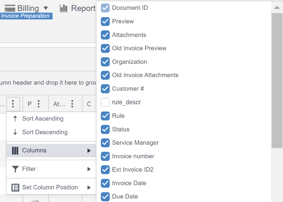
Figure 9: How to navigate to the Hide Columns functionality
The Hide Columns functionality can be easily accessed by clicking on the three dots next to a column. From there, you select the Columns, and then choose which columns you wish to see or hide by clicking the box next to the column header. The visible column headers are marked with the blue check mark.
Hint! In most dashboards, you can save the modified version as a template for effortless access to the changes later.
Collapse All
Collapse All is meant to be used when grid data is being grouped. This will collapse all the data to groups that are defined in the group field. After this the grid will look similar to Figure 8.
Expand All
Expand All is meant to be used when grid data is being grouped. If you wish to see all the data at once, select Expand All.
Clear Custom Settings
Clear Custom Settings resets groupings and filters that are seen in the interface, so that the interface will restore default settings. To utilize this action, simply press Clear Custom Settings.
Clear Filters
Reset filters by pressing Clear Filters. This will reset the filters to default settings. This will only reset filters and not delete groupings or other settings.
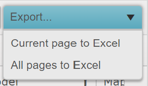
Export
The Export functionality is used to export data to Excel. Choose the current page or All pages. The selection possibilities for items per page is explained in chapter 13.
After selecting the desired Excel outcome, Good Sign will download the Excel file to your computer.
Tip! If the data has been grouped in the grid, the same groupings will appear in the Excel file, and it illustrates the rows as sum rows
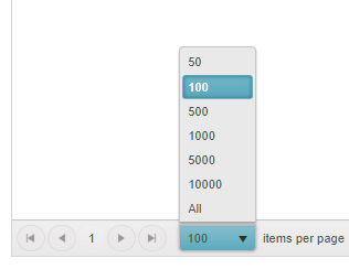
Items per page
The items per page can be selected from the lower left corner of the page. Items can be selected as the first 50, 100, 500, 1000, 5000, 10 000 or All rows.
Caution! Using the All option can be very slow with large amounts of rows (as in, tens of thousands of rows)